Graphical Presentation I
Types of Graphs:
(a) Histogram
(b) Frequency Polygon
(c) Relative Frequency Histogram and Polygon
(d) Cumulative Frequency Polygon or Ogive
(e) Frequency Curves and Smoothed Ogive
(a) Histogram:
1. A histogram consists of a set of adjacent rectangles having bases along x-axis (marked off by class boundaries) and areas proportional to class frequencies.
2. To adjust the heights of rectangles in a frequency distribution with unequal class interval sizes, each class frequency is divided by its class interval size.
|
Class boundaries |
Frequency |
|
109.5-119.5 |
1 |
|
119.5-129.5 |
4 |
|
129.5-139.5 |
17 |
|
139.5-149.5 |
28 |
|
149.5-159.5 |
25 |
|
159.5-169.5 |
18 |
|
169.5-179.5 |
13 |
|
179.5-189.5 |
6 |
|
189.5-199.5 |
5 |
|
199.5-209.5 |
2 |
|
209.5-219.5 |
1 |
|
S f |
120 |
|
Class Interval |
f |
Class Boundaries |
Size |
Adjusted Frequency |
|
10-11 |
4 |
9.5-11.5 |
2 |
4 / 2 = 2 |
|
12-14 |
12 |
11.5-14.5 |
3 |
12 / 3 = 4 |
|
15-19 |
25 |
14.5-19.5 |
5 |
25 / 5 = 5 |
|
20-29 |
60 |
19.5-29.5 |
10 |
6 |
|
30-34 |
25 |
29.5-34.5 |
5 |
5 |
|
35-39 |
15 |
34.5-39.5 |
5 |
3 |
|
40-42 |
6 |
39.5-42.5 |
3 |
2 |
|
|
147 |
|
|
|
(b) Frequency Polygon:
1. It is constructed by plotting the class frequencies against their corresponding class marks (mid-points) and then joining the resulting points by means of straight lines.
2. The ends of the graph so drawn do not meet the ends of x-axis. A polygon is a many sided closed figure. Therefore, extra classes are to be added at both ends of the frequency distribution with zero frequencies.
3. The frequency polygon can also be obtained by joining the mid-points of the tops of rectangles of histogram.
(c) Relative Frequency Histogram and Polygon: Same as described above.
(d) Cumulative Frequency Polygon or Ogive:
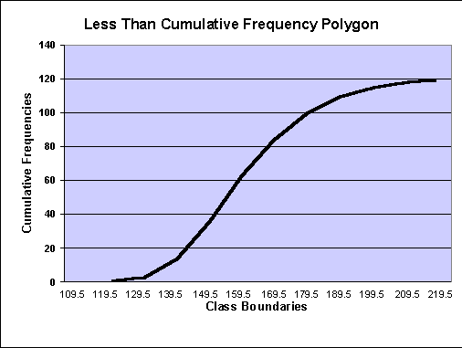
1. The graph showing the cumulative frequencies plotted against the upper class boundaries is called a ‘cumulative frequency polygon’ or ‘ogive’.
2. The graph corresponding to a less than or a more than cumulative frequency distributions are called ‘less-than’ and ‘more-than ogives’ respectively.
|
Class Boundaries |
Frequency |
Less than Cumulative Frequency |
More than Cumulative Frequency |
|
109.5-119.5 |
1 |
1 |
119 |
|
119.5-129.5 |
4 |
5 |
115 |
|
129.5-139.5 |
17 |
22 |
98 |
|
139.5-149.5 |
28 |
50 |
70 |
|
149.5-159.5 |
25 |
75 |
45 |
|
159.5-169.5 |
18 |
93 |
27 |
|
169.5-179.5 |
13 |
106 |
14 |
|
179.5-189.5 |
6 |
112 |
8 |
|
189.5-199.5 |
5 |
117 |
3 |
|
199.5-209.5 |
2 |
119 |
1 |
|
209.5-219.5 |
1 |
120 |
0 |
|
S f |
120 |
|
|
(e) Frequency Curves and Smoothed Ogives:
Types of Frequency Distribution and Curves:
(a) Symmetrical Distribution,
(b) Moderately Skewed or Asymmetrical Distribution,
(c) Extremely Skewed or J-Shaped Distribution,
(d) U-Shaped Distribution, and
(e) Multi-Modal Distribution.
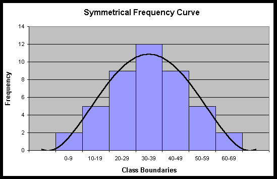
(a) Symmetrical Distribution: A frequency distribution is said to be symmetrical if the frequencies equidistant from the maximum are equal.
|
Class interval |
0-9 |
10-19 |
20-29 |
30-39 |
40-49 |
50-59 |
60-69 |
|
Frequency |
2 |
5 |
9 |
12 |
9 |
5 |
2 |
(b) Moderately Skewed or Asymmetrical Distribution: A frequency distribution is said to be skewed when it departs from symmetry, i.e., when the frequencies tend to pile up in one end or the other end of a distribution.
Asymmetrical distributions are of two types, i.e.:
(i) Positively skewed, and
(ii) Negatively skewed.
(i) Positively Skewed:
|
Class interval |
0-9 |
10-19 |
20-29 |
30-39 |
40-49 |
50-59 |
60-69 |
|
Frequency |
2 |
5 |
12 |
9 |
7 |
4 |
1 |
(ii) Negatively Skewed:
|
Class interval |
0-9 |
10-19 |
20-29 |
30-39 |
40-49 |
50-59 |
60-69 |
|
Frequency |
1 |
4 |
7 |
9 |
12 |
5 |
2 |
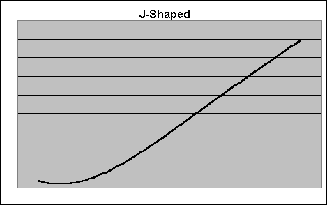
(c) Extremely Skewed or J-Shaped Distribution:
|
Income |
0-1999 |
2000-3999 |
4000-5999 |
6000-7999 |
8000-9999 |
10000-11999 |
12000-13999 |
|
No. of persons |
4000 |
3000 |
2500 |
1500 |
500 |
350 |
150 |
(d) U-Shaped Distribution: In such a distribution, the maximum frequencies occur at both ends and a minimum in the centre.
|
Class interval |
1-5 |
6-10 |
11-15 |
16-20 |
21-25 |
26-30 |
|
Frequency |
45 |
30 |
18 |
12 |
24 |
40 |
(e) Multi-Modal Distribution:
1. Frequency distributions with more than one maximum are called ‘multi-modal distribution’.
2. A distribution with two maxima is called a ‘bimodal distribution’.
(a) Simple Bar Chart,
(b) Multiple Bar Chart,
(c) Component Bar Chart,
(d) Percentage Component Bar Chart, and
(e) Pie Chart.
(a) Simple Bar Chart:
1. Simple bar chart consists of vertical or horizontal bars of equal width.
2. The length of the bars is taken proportionately to the magnitude of the values represented. The width of the bars has no significance.
3. Vertical bars are used to represent quantitative data or chronological data. Whereas, the horizontal bars are represented for qualitative data or geographical data.
4. If the data do not relate to time, then they should be arranged in ascending or descending order of magnitude.
Exports of Pakistan (in US $ million)
|
Year |
Exports |
|
1948 |
138 |
|
1951 |
406 |
|
1961 |
378 |
|
1971 |
683 |
|
1981 |
2958 |
|
1991 |
6168 |
|
2001 |
9202 |
|
2005 |
14410 |
(b) Multiple Bar Chart:
1. Multiple bar chart is an extension of simple bar chart.
2. Grouped bars are used to represent related sets of data. For example, imports and exports of a country together are shown in multiple bar chart.
3. Each bar in a group is shaded or coloured differently for the sake of distinction.
|
Years |
Imports |
Exports |
|
Rs. (billion) |
Rs. (billion) |
|
|
1982-83 |
68.15 |
34.44 |
|
1983-84 |
76.71 |
37.33 |
|
1984-85 |
89.78 |
37.98 |
|
1985-86 |
90.95 |
49.59 |
|
1986-87 |
92.43 |
63.35 |
|
1987-88 |
111.38 |
78.44 |
(c) Component Bar Chart:
1. This chart consists of bars which are sub-divided into two or more parts.
2. The length of the bars is proportional to the totals.
3. The component bars are shaded or coloured differently.
Current and Development Expenditure – Pakistan (All figures in Rs. Billion)
| Years |
Current Expenditure |
Development Expenditure |
Total Expenditure |
|
1988-89 |
153 |
48 |
201 |
|
1989-90 |
166 |
56 |
222 |
|
1990-91 |
196 |
65 |
261 |
|
1991-92 |
230 |
91 |
321 |
|
1992-93 |
272 |
76 |
348 |
|
1993-94 |
294 |
71 |
365 |
|
1994-95 |
346 |
82 |
428 |
(d) Percentage Component Bar Chart:
1. Component bar charts may also be drawn on percentage basis by expressing the components as percentages of their respective totals.
2. All the bars are of equal length showing the 100%. These bars are sub-divided into component bars in proportion to the percentages of their components.
Areas Under Crop Production (1985-90)
(‘000 hectors)
|
Year |
Wheat |
Rice |
Others |
Total |
|
1985-86 |
7403 |
1863 |
1926 |
11192 |
|
1986-87 |
7706 |
2066 |
1906 |
11678 |
|
1987-88 |
7308 |
1963 |
1612 |
10883 |
|
1988-89 |
7730 |
2042 |
1966 |
11738 |
|
1989-90 |
7759 |
2107 |
1970 |
11836 |
Percentage Areas Under Production
|
Year |
Wheat |
Rice |
Others |
Total |
|
1985-86 |
66.2% |
16.6% |
17.2% |
100% |
|
1986-87 |
66.0 |
17.7 |
16.3 |
100 |
|
1987-88 |
67.2 |
18.0 |
14.8 |
100 |
|
1988-89 |
65.9 |
17.4 |
16.7 |
100 |
|
1989-90 |
65.6 |
17.8 |
16.6 |
100 |
(e) Pie Chart:
1. Pie chart is used to compare the relation between the whole and its components.
2. The difference between the component bar chart and pie chart is that in case of component bar chart the length of the bars are used while in case of a pie chart the area of the sector of a circle is used.
3. In pie chart, the circle is drawn with radii proportional to the square root of the quantities to be represented because the area of a circle is given by 2pr2.
4. The sectors are coloured and shaded differently.
5. To construct a pie chart, we draw a circle with some suitable radius (square root of the total). The angles are calculated for each sector as follows:
Angles for each sector = Component Part × 360o
Total


No comments:
Post a Comment